
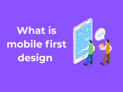
Ever heard the saying, “Good things come in small packages”? Well, this couldn’t be truer for mobile-first design! Starting small isn’t just a strategy—it’s a philosophy that’s shaping how designers build websites today. Let’s dive into why starting with a mobile perspective lays the groundwork for amazing user experiences (UX) across the board.
Why Start Small?
Most of your audience views the web through the lens of their smartphones. Whether they’re scrolling while sipping coffee or searching for services on the go, your first impression is most likely happening in the palm of someone’s hand. Starting with mobile design ensures your website works smoothly and looks stunning on devices where the majority of deep connections first occur.
It’s like building the foundation of a house. If the base is strong, you can expand and scale with confidence. If the mobile experience is seamless, it sets the stage for creating delightful designs on mobile and larger screens.
Key Principles of Mobile-First Design
Designing first for mobile is less about shrinking a desktop experience and more about working smarter with the constraints (and opportunities!) of smaller devices. Here’s how you can do it:
- Start with Content Prioritization: On mobile, less is more. Think about what content your users absolutely need to see first and foremost. Highlight the essentials—core features, text, images, or buttons that serve the main purpose of your site.
- Think Responsively: Your mobile design should adapt effortlessly to different screen sizes. Responsive web design ensures the layout remains user-friendly across device types, from a 5-inch phone to a 13-inch tablet.
- Say Goodbye to Clutter: Use whitespace effectively and avoid crowding the screen with too many elements. A clean, uncluttered interface is easier to navigate.
The Benefits of Embracing Mobile-First
- Efficiency Boost: Designing for the smallest screen forces you to focus on simplicity. As you scale up to larger devices, you can gradually add in more advanced features, rather than stripping things away.
- Improved Performance: Mobile-first design naturally prioritizes speed because lighter designs and efficient code make for faster-loading pages—something mobile users (and search engines) love.
- Future-Proof Designs: With more people relying on their mobile devices every year, starting small ensures your site stays relevant for the long haul.
Design Priorities: Why Less is More on Smaller Screens
When it comes to designing for mobile devices, the phrase “less is more” is more relevant than ever. Think about it — that gorgeous 27-inch monitor you might be staring at doesn’t compare in size to the handful of inches your phone screen offers. So, how do you ensure your design still grabs attention, communicates effectively, and feels intuitive on something so compact? Let’s dive into it!
Focus on the Essentials
Smaller screens demand smarter design. You don’t have the luxury of space, so let’s prioritize!
- Core Content First: Ask yourself, “What must the user absolutely see or do here?” Whether it’s reading an article, booking an appointment, or scrolling through images, strip away the extras until the heart of the task shines.
- Remove the Clutter: Forget that temptation to include every widget, banner, or pop-up. Keep the screen clean, and let your content breathe!
Design with Readability and Usability in Mind
Ever landed on a website where the text was microscopic or buttons were crammed together? Frustrating, right? Here’s how you can avoid those pitfalls:
- Scale Your Text: Favor readable typography that looks crisp on small screens. A font size of at least 16px is standard for mobile readability.
- Touchable Targets: Buttons and links need to be big enough for everyday human fingers. Aim for a touch target of at least 48×48 pixels to avoid those embarrassing, “Oops, I didn’t mean to tap that!” moments.
Embrace Simplicity Over Bells and Whistles
Let’s talk about visuals. Yes, they’re powerful, but too many graphics, animations, or auto-playing videos can overwhelm users. On mobile screens:
- Choose Minimalism: Opt for simple layouts with plenty of white space. It’s not boring — it’s elegance in design!
- Be Mindful of Load Times: Remember that heavy visuals and clutter can slow loading speed, which is a dealbreaker for users. They’ll bounce quicker than you can say “poor UX.” Compress images and optimize performance wherever possible.
Hierarchy is Everything
On mobile, users tend to scroll more than they click. This makes creating a strong hierarchy a must-have. Here’s the trick:
- Prioritize Headlines: Large, bold headlines grab attention and direct users to what they care about most.
- Guide with Spacing: Use padding and margins to separate sections, helping users focus on one thing at a time.
From Fingertips to Thumbs: Crafting Interfaces for Mobile

Let’s talk about something we all rely on daily—our thumbs. When it comes to mobile design, it’s not just about creating something beautiful; it’s about functionality and ease-of-use, tailored for those touches, swipes, and taps we make with our fingertips. **Why? Because the thumb is king on mobile interfaces!**
Picture this: you’re scrolling through your favorite app with one hand (you’re probably holding a coffee in the other—no judgment here). If the navigation buttons or interactive elements are out of comfortable thumb-reach, frustration sets in. That’s why designing with thumbs in mind is non-negotiable for creating a delightful mobile experience.
The Thumb Zone: Designing for Comfort
The first principle of thumb-friendly design lies in something called the “thumb zone.” This refers to the natural area of the screen that users can easily access with their thumbs while holding their devices. **Good news for you: researchers have already mapped this out.** Here’s the breakdown:
- Easy-to-reach zone: This is the sweet spot where thumbs rest naturally. Place primary navigation, call-to-action buttons, or essential interactive elements here. Think bottom-third of the screen on most smartphones.
- Stretch zone: This zone is a bit harder to reach but still manageable. You can place less critical actions or features here, but don’t make users work too hard; their thumbs have limits.
- Hard-to-reach zone: This includes the top corners of the screen. Keep interactions in this area to a minimum or reserve it for non-essential elements.
Designers should always test their layouts within these zones to ensure they’re intuitive and effortless for users.
Tap Targets: Bigger is Better!
Let’s talk about buttons, links, and anything else we’re expected to click or tap on our phones. If you’ve ever attempted to click on a tiny link and accidentally hit something else (*cue groaning*), you’ve experienced poor tap target design. Trust me, it’s a dealbreaker.
Here are a few non-negotiable rules:
- Size matters: Make buttons and tap targets at least 48×48 pixels to ensure fingers of all sizes can tap comfortably. As a rule of thumb (pun intended), aim for a minimum 10mm square area.
- Space it out: Avoid clutter by leaving adequate space between tap targets, reducing the likelihood of misclicks.
Gestures: Think Beyond Taps
Mobile users love swiping, pinching, and double-tapping, and modern mobile interfaces thrive on these gestures. Incorporating intuitive gesture controls can elevate your user experience, but don’t overcomplicate it. Some golden rules include:
- Make gestures feel natural. For example, swipe left to delete or pinch to zoom.
- Don’t rely solely on gestures for navigation. Always provide alternative UI elements for users unfamiliar with advanced gestures.
Thinking Ahead: Scaling Up from Mobile to Desktop
Picture this: you’ve just nailed your mobile design. It’s sleek, fast, and users are loving it. But the challenge now is, how do you scale that streamlined experience up to desktop devices? That’s what “thinking ahead” is all about in mobile-first design strategy. Let’s dive into how you can adapt your designs to grow gracefully from pocket-sized screens to widescreen monitors.
Why Start Small and Scale Up?
When designing for mobile-first, you’re working with constraints that naturally push you to prioritize usability and functionality. Limited screen real estate means focusing on what truly matters. It also ensures your design’s foundation is naturally clean and efficient. Scaling up allows you to strategically expand rather than unnecessarily clutter your user experience on larger screens.
Think of it like building a house: mobile-first design lays down the strong, stable foundation, and scaling up allows you to add those extra rooms (features) while keeping everything structurally sound.
Key Tips for Scaling from Mobile to Desktop
So, how do you approach this evolution thoughtfully? Take a look at these key principles:
- Maintain Consistency: Your users should feel like they’re still in the same “app world” whether they’re on their phones, tablets, or desktops. Consistency in branding, navigation, and functionality helps foster familiarity and trust.
- Embrace White Space: On mobile, you’re forced to keep things compact. On desktop, you’ve got more breathing room! Use that extra space wisely without overcrowding the screen. White space helps users focus on the most important elements.
- Adapt, Don’t Just Stretch: Don’t merely blow up your mobile design to fit a bigger screen. Use the additional real estate to create enhanced layouts or add secondary features, like sidebars or larger images, while keeping the core design intact.
- Optimize for Performance: Desktop users might have a faster internet connection, but don’t fall into the trap of making your site bloated. Fast, responsive websites win loyalty—on any device.
Responsive Techniques That Shine
Responsive design and flexible layouts are your best friends when scaling for desktop. A few practical techniques include:
- Media Queries: These allow you to apply specific CSS rules depending on the screen size. For example, a three-column grid might appear on desktop, while a single-column layout works perfectly for mobile.
- Fluid Grids: A flexible grid system ensures that your design elements resize proportionally while filling the screen effectively regardless of device size.
- Flexible Images: Use responsive images that adapt to screen size and resolution. Tools like the
<picture>element give you control over how images are displayed across devices.
Keep Your Users at the Center
Never forget: your ultimate goal is user satisfaction. Ensure all design decisions stem from user behavior and needs. Observe how they interact with your site on both mobile and desktop to uncover opportunities for improvement. Test frequently, gather feedback, and iterate to perfection.
Scaling up from mobile-first doesn’t have to be overwhelming. Treat it as an opportunity to enhance—not complicate—your user’s experience. By respecting your mobile-first foundation and thoughtfully adding functionality, your designs will effortlessly shine no matter the screen size.
So go ahead, scale up with confidence—your users will thank you!
SEO Advantages: How Mobile-First Design Impacts Search Rankings

Did you know your website’s mobile experience can make or break your search rankings? That’s right! Modern-day SEO is often synonymous with mobile-first design. Let’s dive into how embracing mobile-first design can give your site a competitive edge in search rankings while shining a spotlight on user experience.
Why Mobile First? A Quick Recap
Search engines, especially Google, have shifted their focus toward mobile-first indexing. This means Google’s algorithms primarily use the mobile version of your website for indexing and ranking—not the desktop version. Simply put, if you’re ignoring the mobile experience, you’re potentially ignoring a big chunk of your SEO opportunity too.
Mobile-First Design: The Easy SEO Wins
Here’s the best part: focusing on mobile-first design isn’t just about pleasing Google (though that’s important)—it’s also about delivering a stellar experience for your users. Here’s how it all connects to better SEO:
- Faster Loading Times: Speed is a critical ranking factor, and optimizing for mobile means trimming resources, compressing images, and using responsive design—all of which make your website faster. Potential customers love speedy sites, and so does Google.
- Responsive Design Matters: A mobile-first site automatically adjusts to fit various screen sizes. This adaptability doesn’t just make your site look great everywhere—it also signals to search engines that your website is user-friendly.
- Reduced Bounce Rates: Have you ever clicked on a site from your phone only to leave immediately because it displayed horribly? High bounce rates can hurt your rankings. Mobile-first design keeps visitors engaged by offering a seamless experience.
- Improved User Experience (UX): Great SEO and great UX go hand in hand. When mobile users can navigate easily, explore content without pinching and zooming, and simply enjoy the website, they tend to stay longer—another plus for search rankings.
Mobile-Friendly and Ranking-Friendly: A Perfect Match
So, what exactly makes a site mobile-friendly from an SEO perspective? Here are some best practices:
- Use a Responsive Design: This ensures your site works beautifully on any device, no matter the screen size or orientation.
- Optimize Images: Shrink those file sizes without sacrificing quality to boost speed.
- Use Readable Fonts: Tiny text on mobile screens is a no-go. Web-safe fonts at a readable size are a must.
- Prioritize Tap Target Sizes: Buttons and links on mobile sites should be large enough to tap without frustration.
- Design for Slow Connections: Not everyone has lightning-fast internet. Craft your mobile experience with 3G or slower speeds in mind.
Authority, Trust, and Relevance
Google loves websites that feel trustworthy and relevant—mobile-first design is key to achieving this. Why? Because a mobile-friendly site caters to real-world users wherever and however they’re browsing. As a result, you’re not just optimizing for search engines; you’re building a site that fits beautifully into the life of the average user.
Accessibility First: Reaching Every User through Mobile Design
Let’s talk about something that matters to all of us – inclusivity! And when it comes to mobile design, accessibility isn’t just a feature; it should be the heart of what we create. After all, mobile-first design isn’t just for the tech-savvy – it’s for everyone, regardless of ability, age, or background. Let’s dive in and unpack how we can prioritize accessibility for the most inclusive mobile designs possible.
Why Accessibility is a Non-Negotiable
For starters, creating an accessible mobile experience isn’t just being considerate – in many cases, it’s a legal requirement! Various global standards help ensure websites and apps are usable by everyone. But beyond compliance, accessible design builds trust, boosts user engagement, and often makes things simpler for everyone (bonus points for universal appeal!).
Principles of Accessible Mobile Design
Not sure where to start? Here’s the lowdown on designing with accessibility front and center:
- Readable Text: Small screens are hard enough to navigate – don’t make it worse with tiny fonts. Stick to a minimum font size of 16px, and provide good contrast between text and background for readability.
- Enough Room to Breathe: Ever try tapping a tiny button on your phone only to hit the wrong one? Frustrating, right? Design buttons and touch targets to be at least 48×48 pixels for a seamless experience.
- Aim for Keyboard Accessibility: While “keyboard-only” users are often associated with desktops, similar accessibility considerations apply to mobile users who rely on alternative input methods.
- Follow Image and Media Standards: Ensure all images, icons, and media have descriptive
alttext. For video, include captions so everyone can follow along even if sound isn’t an option.
Color Contrast: A Small Detail, Big Impact
Colors convey so much – but they’re not always easy for everyone to interpret. Use tools to ensure your contrast ratios meet accessibility guidelines. This helps accommodate users with color blindness or low vision and creates a more inclusive experience.
Accessible Navigation
Good navigation is like a great tour guide – it directs users without confusion. When designing for mobile:
- Implement a clear and concise menu structure.
- Use ARIA (Accessible Rich Internet Applications) labels to describe links and buttons.
- Support screen readers so visually impaired users can easily navigate your content.
Testing for Accessibility
You’ve designed for accessibility – great! But how can you be sure it works in the real world? Test, test, and test again. Tools like Axe, WAVE, and browser accessibility tools can help you pinpoint any gaps. Better yet, involve users with disabilities during testing for genuine, actionable feedback.
Strive for Connection, Not Perfection
Here’s the thing – accessibility isn’t about getting everything “perfect.” Mobile design evolves constantly, and so do user needs. The key is to remain flexible, keep listening, and aim for continuous improvement. Every small step towards inclusivity is a win for your audience and your brand.
Real-World Wins: Success Stories of Mobile-First Strategies
Ever wondered why some modern businesses thrive in a competitive digital world while others struggle to keep up? It’s all about smart strategies, and today, we’re going to spotlight some *real-world wins* showcasing the magic of mobile-first design. Grab a cup of coffee, sit back, and let me walk you through how brands have completely transformed their game with this approach!
What is Mobile-First Design (Quick Recap)?
Before we dive into the juicy success stories, let’s quickly revisit what mobile-first design means. It’s all about designing your website or app with the smallest screen in mind first (hello smartphones!) and scaling upwards from there. By prioritizing mobile users, you’re catering to the majority—because let’s face it, most of us live with our phones glued to our hands.
Success Story 1: A Retail Giant Goes Mobile-Centric
Picture this: A major global apparel brand—let’s call them FashionForward—realized that over 70% of its traffic came from mobile devices. Still, their less-than-stellar mobile experience was driving frustrated customers to competitors. The solution? A full mobile-first redesign!
They simplified product filtering, added large, tappable buttons, and reduced image-heavy content to speed up loading times. The results were mind-blowing:
- 35% increase in mobile conversions
- 20% faster load time, reducing bounce rates
- Happier shoppers who left great reviews about their revamped experience
This brand is a fantastic example of how revamping for mobile-first can directly impact revenue and customer satisfaction.
Success Story 2: Revolutionizing the Food Industry One Click at a Time
When it comes to food delivery, speed is everything. A leading food delivery service realized that their customers wanted easy navigation, fast ordering, and minimal distractions. Instead of overwhelming menus and clunky interface designs, they implemented these mobile-first changes:
- Streamlined checkout steps (think two clicks and done!)
- Added geotargeting for accurate delivery locations
- Implemented push notifications to match customer behavior
The result? Total game-changer for the business:
- 50% increase in mobile orders.
- Zero complaints about confusing interfaces.
- Customers returning to order weekly.
Success Story 3: A Local Startup’s Big Break
Smaller players in the game have also seen massive benefits from mobile-first approaches. A local fitness studio introduced a mobile-first booking app with an ultra-clean layout and immediate scheduling results. Clients could register for classes on-the-go, check availability without refreshing, and even sync it all with their calendars.
What’s more, their mobile-friendly site became a hit with Google search rankings, bringing in new customers from organic searches! Talk about a double win—convenience for customers and visibility for the business.


