


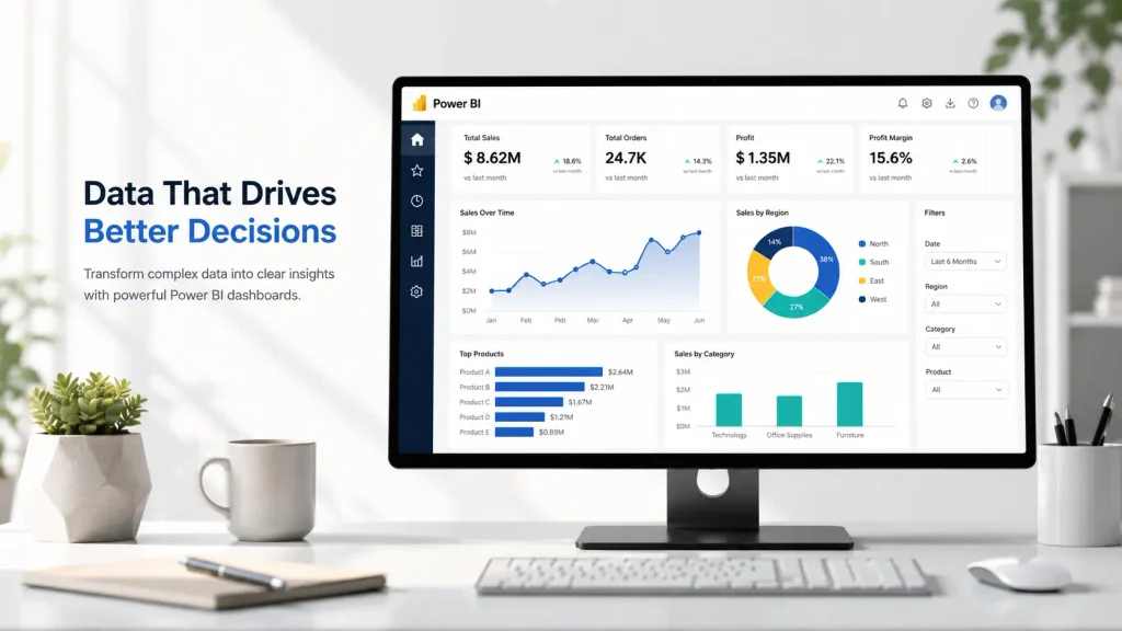
Power BI dashboards help teams turn complex information into something easier to monitor and act on. Instead of working through disconnected reports or dense spreadsheets, users can bring key metrics into one view, track performance more quickly, and spot issues earlier.
The real value comes from structure and clarity. A strong dashboard highlights what matters first, then gives users a path to explore the details behind the headline numbers.
This article explains why effective dashboards matter, how they differ from reports, and which Power BI features help turn raw data into more useful analysis for decision-making.
Understanding the Power of Effective BI Dashboards
A Power BI dashboard is built to surface the most important insights quickly. Microsoft describes a dashboard as a single-page canvas that tells a story through visualizations, while reports are better suited to deeper, multi-page analysis.
Single-Page Insights vs. Multi-Page Reports
Dashboards and reports serve different purposes. A dashboard is usually a single-page view that brings together key visualizations, metrics, and status indicators in one place. It works well when users need a quick snapshot of performance and a clear starting point. Microsoft’s Power BI documentation also notes that dashboards can display visuals from one or more reports on a single page.
Reports go deeper. They typically span multiple pages and support more detailed filtering, breakdowns, and analysis. That makes them better suited to users who need to investigate trends, compare segments, or answer specific business questions in more detail.
This difference matters because each format supports a different type of decision-making. A dashboard is useful for monitoring. A report is useful for exploration.
For teams looking for inspiration on layout and business-ready reporting, Zebra BI dashboards provide examples of Power BI dashboards designed to present key metrics more clearly and support faster analysis. Zebra BI’s examples page includes interactive dashboard samples and downloadable PBIX files built around business reporting use cases.
Single-page dashboards are often especially useful for executives, sales leaders, and operations teams that need immediate visibility into performance. Multi-page reports are more useful for analysts and department leads who need to explore the underlying data in greater depth.
Why Visual Data Matters for Business
Raw data on its own often slows decisions down. Teams spend time asking follow-up questions, waiting for clarification, or interpreting tables that do not make the main point obvious.
Visual dashboards reduce that friction. Charts, KPI summaries, and well-structured layouts make it easier to recognize trends, exceptions, and relationships quickly. A strong visual design gives users a shared view of performance, which makes reporting easier to discuss across finance, sales, operations, and other teams.
The Role of Interactivity
One of the biggest advantages of Power BI is that dashboards can connect users to deeper analysis without overwhelming the first view. Users can move from a high-level summary into related reports and supporting detail instead of waiting for someone else to prepare a separate breakdown.
That makes dashboards more useful because they support both quick monitoring and follow-up investigation. It also helps teams respond faster when questions come up during meetings or performance reviews.
Key Features That Transform Your Data Analysis
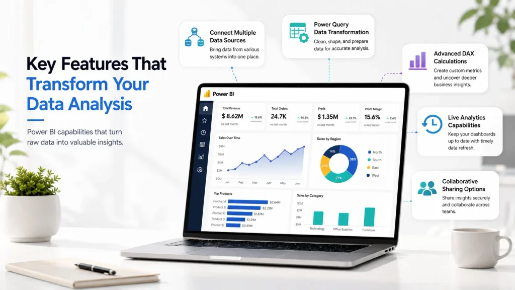
The strength of a Power BI dashboard depends on more than visual design. It also depends on the features behind it that let teams connect, structure, calculate, refresh, and share data more effectively.
1. Connecting Multiple Data Sources
Power BI supports a wide range of data sources, including files, databases, Azure services, and many other business systems. Microsoft’s documentation highlights broad support for connecting, transforming, and managing data across cloud and on-premises sources.
That matters because many business questions rely on more than one system. Sales performance might require CRM data, finance data, and regional context. Operational reporting may depend on internal systems, plus external files or service platforms. A well-built dashboard brings those sources together in a way that supports more consistent analysis.
2. Power Query Data Transformation
Power Query helps prepare raw data for reporting. It supports tasks such as filtering rows, removing unnecessary columns, merging queries, appending files, and reshaping data before it reaches the dashboard. Microsoft positions Power Query as a core part of connecting, transforming, and refreshing data in Power BI.
This step matters because even a polished dashboard can become misleading if the source data is inconsistent. Once the transformation logic is defined, it can also be reused during refreshes, which reduces repeated manual work.
3. Advanced DAX Calculations
DAX is what allows analysts to move beyond simple totals and averages. It supports calculations such as year-to-date totals, time comparisons, variance measures, and custom business logic. Microsoft’s DAX documentation describes it as the formula language used in Power BI and documents a broad library of functions for analytical modeling.
The value of DAX is not only technical. It helps teams answer more useful questions from the same data model and build dashboards that reflect how the business actually measures performance.
4. Live Analytics Capabilities
Near-real-time analysis can make dashboards more valuable when teams need to monitor current performance closely. Power BI supports multiple refresh approaches, and Microsoft’s refresh documentation explains that reports and dashboards are updated as underlying semantic models refresh. Scheduled refresh can also be configured in the Power BI service.
Frequent refresh is most useful when the underlying data is stable, and the dashboard is built around metrics that require timely action. In those cases, users can respond faster than they could with static reporting snapshots.
5. Collaborative Sharing Options
Power BI also supports sharing and collaboration through workspaces, apps, and role-based access across the Power BI service. Microsoft’s documentation presents these as core parts of how teams create, distribute, and consume dashboards and reports.
That matters because dashboards become more valuable when the right people can access them, understand them, and use them in decision-making without creating confusion around permissions or ownership.
Conclusion
Effective Power BI dashboards improve data analysis by making important information easier to see, easier to explore, and easier to share.
Their value comes from a combination of focused metrics, clear layout, reliable data preparation, and features that support deeper analysis when needed. Dashboards work best when they provide a strong starting point for monitoring, while reports handle the more detailed investigation behind the scenes.
With the right structure and business context, dashboards help teams spend less time searching for answers and more time acting on what the data shows.